Artist Blog
What colour paper should I use?
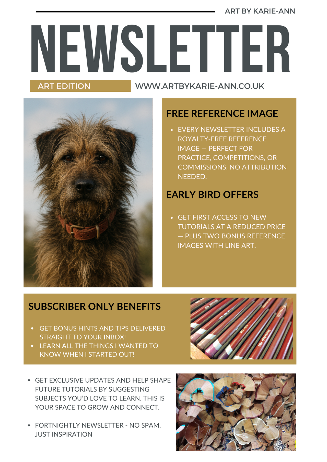
 Art by Karie-Ann

A very often asked question about what colour paper to use for artwork, there are a few things to consider.
I have been asked this question many times and it's been asked in many forums and art groups. It's not an easy answer as it depends on many factors so not a one size fits all response.
Are you using a translucent or opaque medium?
- Colour pencils and watercolour pencils are translucent meaning the paper shade will show through so even if you cover every inch of the paper it will have a hint of the paper colour adding to the overall shade of your artwork.
Pastels, charcoals, graphites are more opaque, if you are completely covering the paper, the paper colour will not make any difference. Use a paper you feel you won't use elsewhere as it won't be seen.
Are you leaving the background exposed?
If you are leaving the background paper exposed you need to be more considered. You have two basic options, firstly choose a complimentary shade from the subject itself, this will create a coordinated piece and will look more of a harmony of colours. If you want your artwork to pop, choose a shade from the opposite side of the colour wheel, so if your artwork is warm, choose a cool shade of paper and vice versa. This could be slightly jarring to look at so choose carefully but it could also bring your piece to life, making it stand out and be eye catching.
Warm or cool?
Do you want the artwork to look warm or cold? Blue, grey, green paper will all keep your artwork on the cool end of the scale whereas yellow, orange, red will keep it warm. It all becomes even more complicated if you use a mixed coloured paper, say a purple which is a blue/red mix, so a cool tone and a warm tone mixed together. This is where I would recommend doing a trial piece to see which is more prevalent, cool (bluey) or warm (more red) and see how it effects your artwork.
 |
Use a signature colour
Another option is to use a signature colour for your paper. You will then create a body of work which will be obviously yours. Your technique and materials will sing out and people will be able to recognise your style and materials as well as your subject matter.
Don't be afraid to use a prominent colour, not everyone wants an exposed white background. Chosen carefully a coloured paper could add something extra to your artwork.
Categories: : pastel paper
Want to create stunning pastel portraits without overspending?
Get my FREE Pastel Artist's Toolkit Ebook
Hi, I’m Karie-Ann — a UK-based wildlife and pet portrait artist. I’ve created this toolkit to help fellow artists save money, avoid overwhelm, and feel confident with their pastel materials. Whether you’re just starting or refining your technique, this guide is for you.